Styling the Paazl checkout widget

This article describes how each checkout widget style parameter affects the widget's design. Integrating the Paazl checkout widget step by step explains where to define these variables in your webshop's checkout page HTML.
The values you can assign the parameters are the same as those you would assign to their CSS equivalents. Example values are given in the code sample provided in Integrating the Paazl checkout widget step by step.
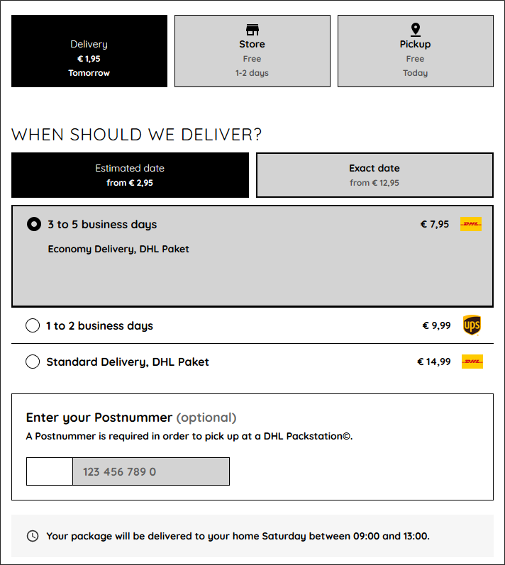
Default widget style
This is the how the checkout widget will look if you don't apply any styling.
Tabs default
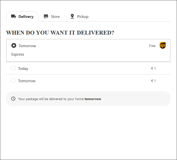
Buttons default

Global settings
brand-global-radius
Example: brand-global-radius: 50px

Colors
In the examples below, the elements affected by the various parameters are colored red.
brand-color-background
Example: brand-color-background: #FF0000

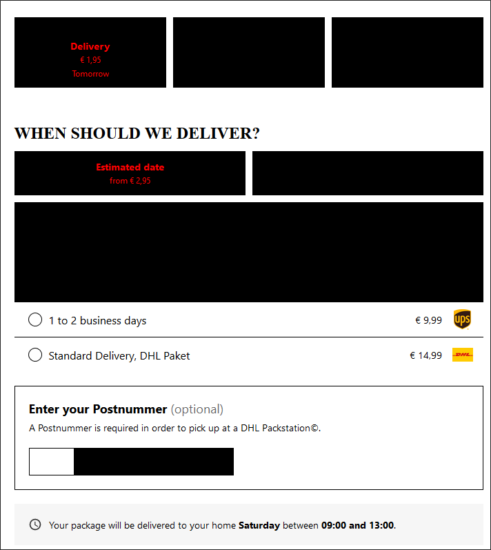
brand-color-body
Example: brand-color-body: #FF0000

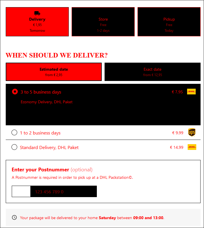
brand-color-border
Example: brand-color-border: #FF0000

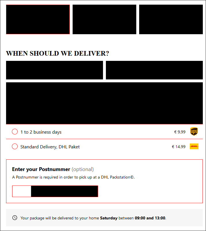
brand-color-focus
Example: brand-color-focus: #FF0000

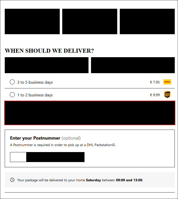
brand-color-primary
This parameter only affects the "Select a different..." button of the "Store" and "Pickup" tabs.
Example: brand-color-primary: #FF0000

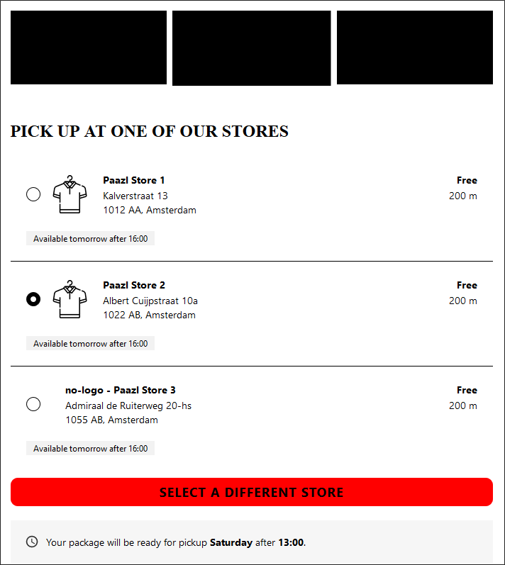
brand-color-secondary
This parameter affects both the selected shipping option as the inactive (unselected) tabs.
Example: brand-color-secondary: #FF0000

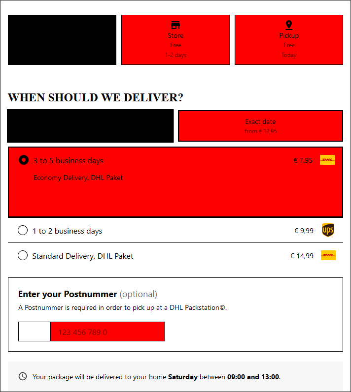
Fonts
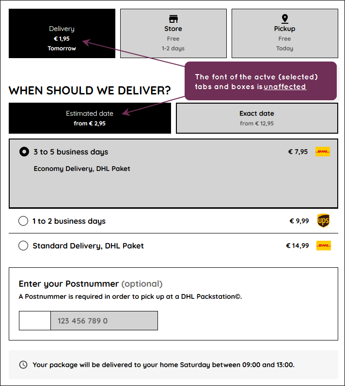
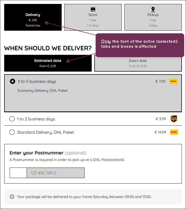
In the examples below, the elements affected by the various parameters are either displayed in Courier font or heavily bolded.
brand-font-family-body
Example: brand-font-family-body: Courier
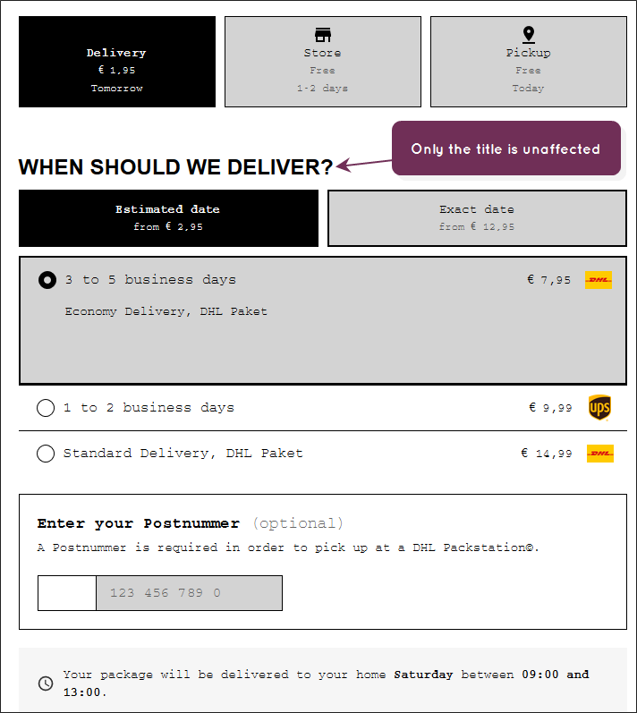
brand-font-family-title
Example: brand-font-family-title: "Courier"


brand-font-weight-bold
Example: brand-font-weight-bold: 900

brand-font-weight-regular
Example: brand-font-weight-regular: 900

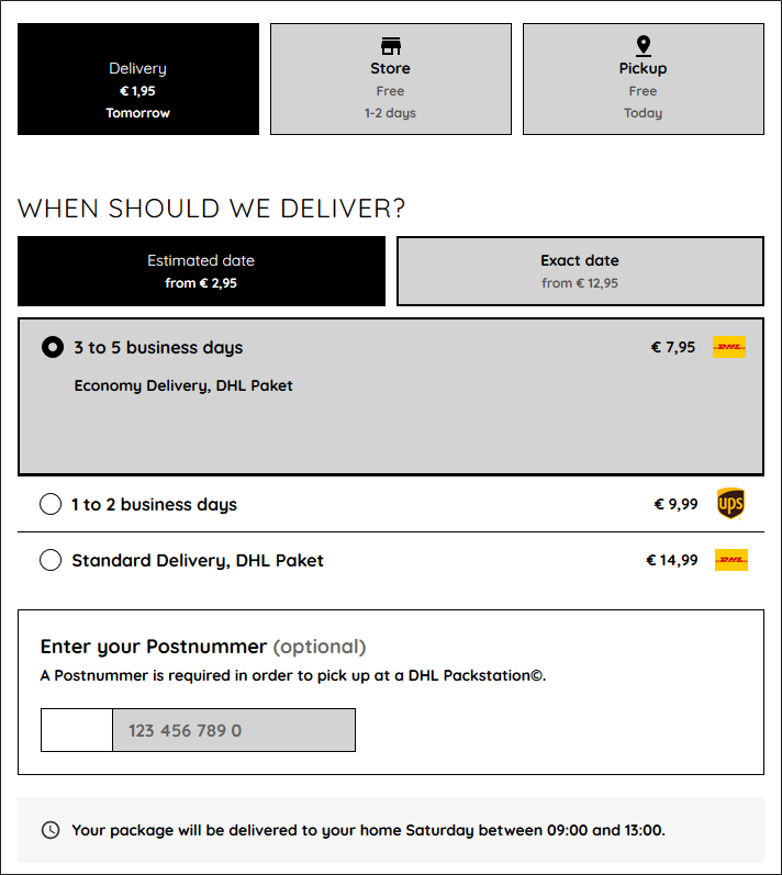
Title
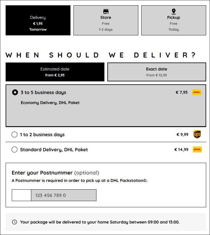
These settings affect titles. In the example below, this is the title "When Should We Deliver?"
brand-title-spacing
Example: brand-title-spacing: 14px

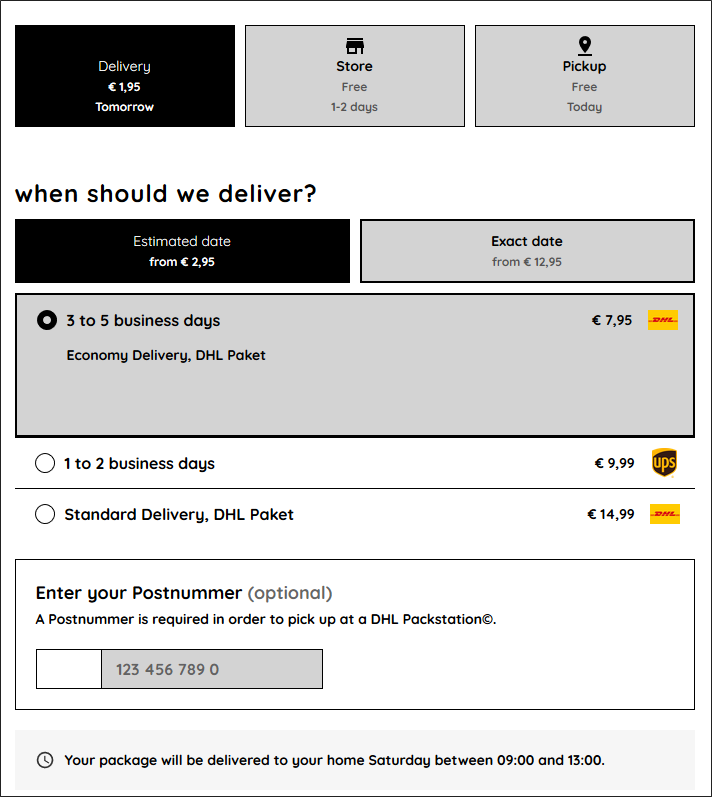
brand-title-transform
This parameter can take one of three values: uppercase, lowercase and capitalize.
Example:
brand-title-transform: lowercase

brand-title-weight
Input
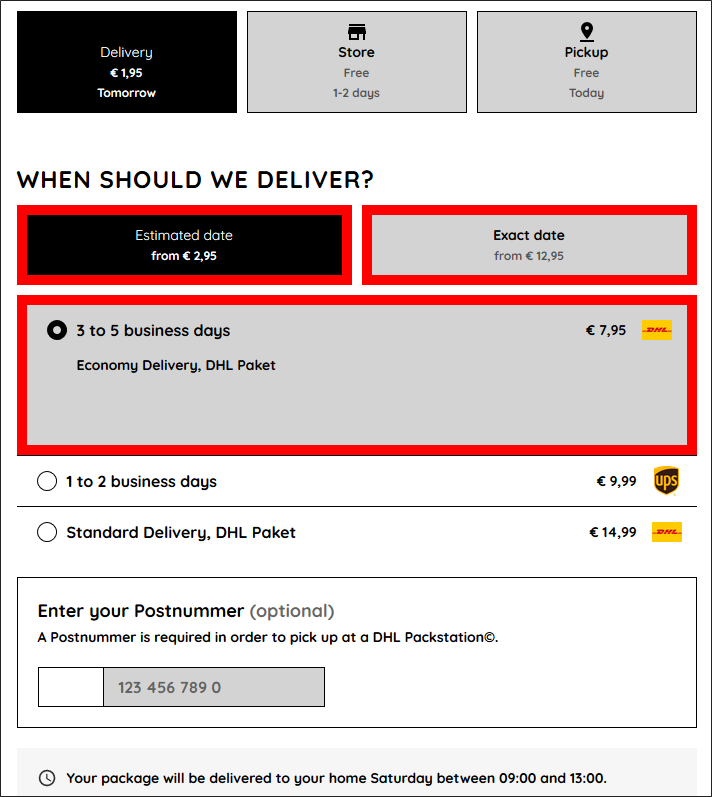
The borders affected are shown in red.
brand-input-border-color
Example: brand-input-border-color: #FF0000


brand-input-border-width
Example: brand-input-border-width: 10px

Button
This set of parameters only affects the "Select a different ..." button on the"Store" and "Pickup" tabs.
brand-button-font-color
Example: brand-button-font-color: #FF0000

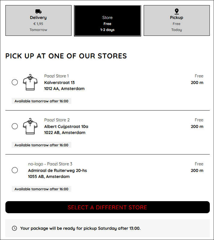
brand-button-font-size
Example: brand-button-font-size: 30px

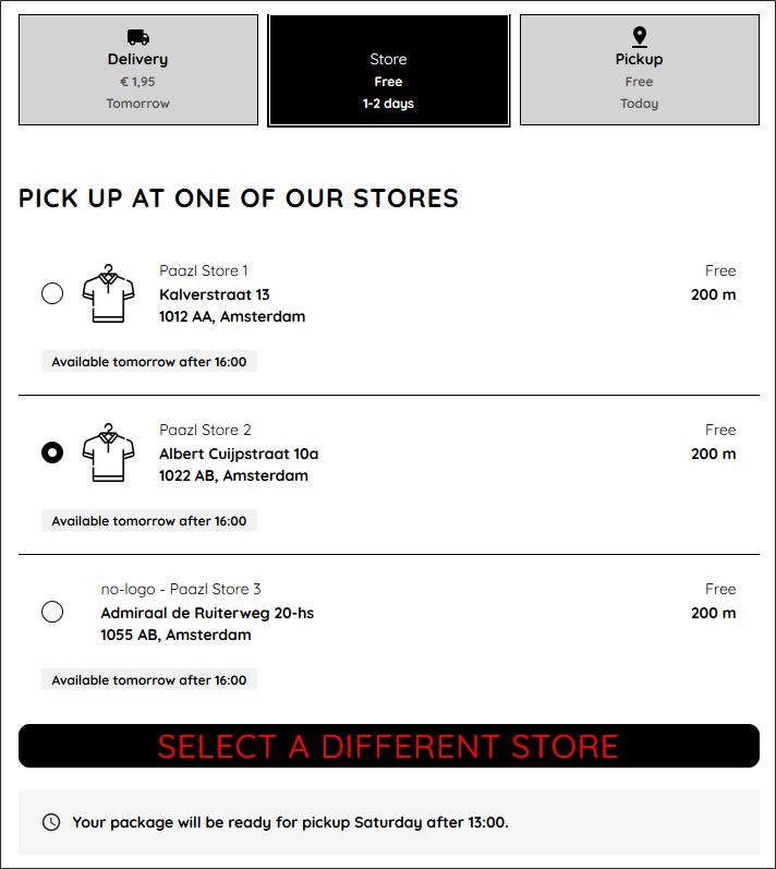
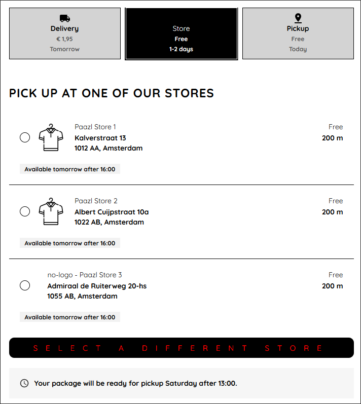
brand-button-font-spacing
Example: brand-button-font-spacing: 16px

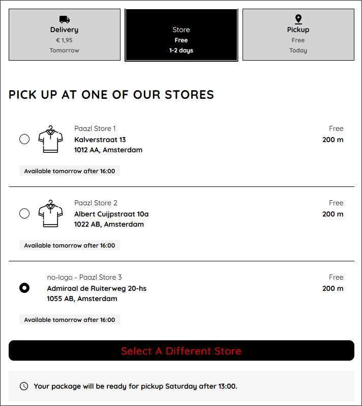
brand-button-font-transform
This parameter can take one of three values: uppercase, lowercase and capitalize.
Example:
brand-button-font-transform: capitalize

brand-button-radius
Example: brand-button-radius: 25px


brand-button-font-weight
Example: brand-button-font-weight: 900